 Hello, I'm Evelyn. I'm a self-proclaimed crafty pants, a Type A designer, a blog junkie, a nerdy gamer girl, a relentless movie quoter, a globetrotter, a foodie to the max (with a soft spot for taco trucks) and a teller of tales. If you were to ask my hubsy about me, he would tell you I like beer, bacon and cigars. Thanks for visiting! xo, Ev
Showing posts with label EYE CANDY. Show all posts
Showing posts with label EYE CANDY. Show all posts
8.11.2010
Lorena Barrezueta VS. Crate & Barrel 'Foil' Collection
4.28.2010
Wanted on Wednesday: Let There Be (Mason Jar) Light!
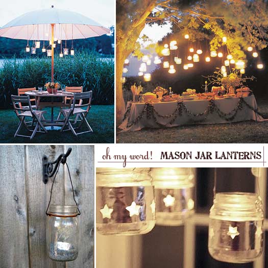
{top images: Martha Stewart; bottom left: Re-Nest; bottom right HGTV}
Words cannot explain how much I adore DIY mason jar lanterns. I especially love the look of tiny glass jars hanging low from a patio umbrella -- that could be a great way to upcycle old jam jars, don't you think?
2.27.2010

2.26.2010
Move Over, Ikea

{source}
How I wish we had it here in the States! I'm beyond in love with H&M's Spring 2010 Home collection. These photos make me want to do some serious Spring cleaning. The kitchen island and natural linens make me giddy. Partly, I think it's seeing bright green through the windows that is making me smile. Oh grass, how I miss you so.
2.22.2010
Paulina Reyes for Harvey Faircloth SS10
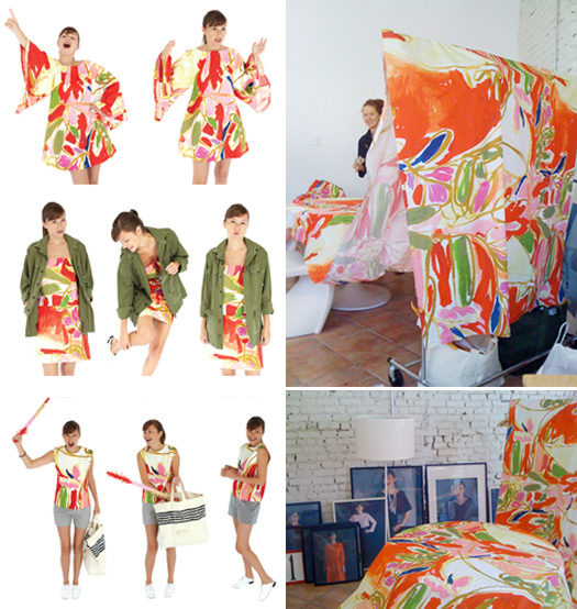
{image}
I'm willing to bet that this fantastically bold Paulina Reyes for Harvey Faircloth fabric is on the Spring/Summer 2010 hot list. It's already making quite a stir across the blogosphere {like here, here, here and here, just for starters.}This colorful print definitely reminds me of warm, sunny places, and mai tais or, possibly, vintage porch furniture. Whether that's a good thing, I'm still on the fence. What do you think...hot or not?
P.S. Can't wait for the SS10 line to be available in HF's online shop. How darling is that sleeveless tunic and those preppy shorts? Summer cannot come quickly enough to the east coast. Just sayin'.
2.19.2010
Plate Wall + Cathrineholm
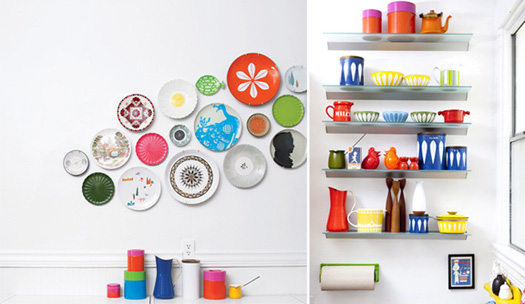
{Lisa Congdon, Lena Corwin, Cathrineholm -- oh my! all via Dwell.}
"I owe my color sense to crayons." - Angelo Rafael Donghia
2.17.2010
minimarket: SS10 look book
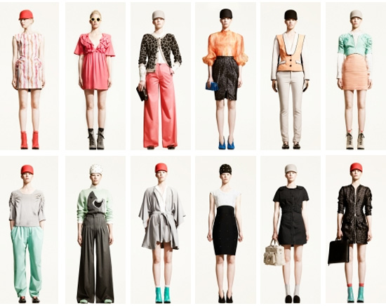
{image}
Loving the Spring/Summer 2010 looks from Swedish design house minimarket, especially the gray kimono dress and the pops of robin's egg and berry. And the shark sweater? C'mon, that's just awesome.
1.21.2010
Candy-Colored Kids' Room


How darling is this bedroom? It appeals to my inner Scandinavian, I think. The bright candy colors pop against the crispy white walls and furnishings. Simple, clean & whimsical, just the way a children's room should be.
Details I'm especially loving: the big window, the dowel-rod book display case & the bunting/pennants.
Another thing I love about this room is how easy + affordable it would be to duplicate. There's a lot of potential for thrifting, repurposing, upcycling and infusing other green techniques in a space like this, too. Wood flooring could be sustainable bamboo or cork (which is naturally mildew-resistant, warm underfoot and a great insulator). Milk paint would transform those found furniture pieces into kid- and earth-safe items. Vintage fabrics and hand-me-down toys & books would help transform this blank slate into a magical space. Also, this room has staying-power. By that I mean, this is the kind of room that could grow with a child over the years. It wouldn't take but a few changes to update this room into something for a bigger kid or teen.
1.16.2010
Dear Luxirare, I Can Hardly Find the Words...

{luxirare...food crayons. damn that's clever.}
It's moments like these that I freaking love Twitter. Thanks to checking out some amazing folk's tweets, (first SweetTartlette, then Bakerella, then through Bakerella's blog), I found Luxirare. I almost couldn't wrap my brain around half of what I saw. Near spontaneous combustion (which I think would be an interesting way to go, if you asked me.) Sure I might come off like Betty Crocker, but I really am an edgy little minx when I want to be and this sassy pants has seriously fierce fashion sense. Her black YSL platform heels bring a tear to my eye. Everything about Luxirare appeals to me.
Go. Just go right now and try to pick a favorite photo.You'll see what I mean.
Oh and I love this..."They’re just clothes, who cares? If there was a meteor shower tomorrow your Chanel bag isn’t going to save you." No, but those YSL Tributes just may.

{luxirare...hardware on a balenciaga coat. newest bff.}
12.07.2009
{While I'm Away...} Rinse Mushroom & Kamisabi Ghosts
Mr.'s BFAM (aka "Brother From Another Mother", BFF, groomsman and our old roommate) Yosuke brought us all cool little gifts from Tokyo when he came for the wedding (because he's super generous and cool like that.) I LOVE my little "rinse mushrooms" and kamisabi paper punch-out ghosts! He got Sissy a bright lime green matroyshka doll-shaped cell phone case that is completely adorable. Not to mention the "moms" gifts...a set of two delicate bone china teacups and saucers. I'll see if I can get a hold on some photos to share :)
P.S. He isn't really Hubs' brother...they are just such good friends it's like they were separated at birth ;) I can't wait to visit him in Japan. One day, I hope!
P.S. He isn't really Hubs' brother...they are just such good friends it's like they were separated at birth ;) I can't wait to visit him in Japan. One day, I hope!
 {detail}
12.03.2009


10.16.2009
{Etsy Love} Cocopunkz
Oh Etsy, you've done it again. You've brought to light yet another amazing talent. Cocopunkz, you make me swoon. Just look at these shoes?! Ah. Maze. Ing. They remind me a bit of the works by once-local, gone-West-Coast artist Jeremy Nichols (Raskoe). Sole Classics is still one of my favorite stores to visit because of his murals (top).
 {My faves. Infatuation is right.}
 {Obsession}
 {Kamikaze}
 {Dancing Cranes}

 {My faves. Infatuation is right.}
 {Obsession}
 {Kamikaze}
 {Dancing Cranes}
10.13.2009
The Big Reveal: Invitations


With that being said, it's time to reveal the glory that is our wedding invitation suite. It was my true labor of love and one obsession. Really, I cared more about the invitations than the flowers and *almost* the dress. I'm very pleased with the way they turned out and proud of my work. Enjoy!
The details:
· Design for all pieces: me
· Printing: letterpress (invitations), digital 4-color (RSVPs) by Mercurio Brothers
· Paper stock for invitations & RSVPs: Somerset Soft White 300 gm Velvet
· Inner & outer envelopes: Strathmore square flap 80lb Wove in Natural White
· Calligraphy: Future MIL!
· Paper stock for maps/insert: Paper Source (printed at home on the Canon i560)
· RSVP envelopes: Paper Source
· RSVP labels: designed & printed at home on Canon i560, Avery labels
· Custom embosser/return address: Three Designing Women
{In addition to what you see, there were 5x5 double-sided custom maps and directions cards, a 1.5" brown card stock belly band with an 1/8" wide double-wrapped satin ribbon to hold all of the pieces together. *note: I got the color as close as possible, but isn't quite right. It's more a muted warm yellow, rather than a bright yellow as in the foreground of image 1.}
 {Please do not copy images without my consent!}
9.29.2009
Butcherblock Love
We eat, prepare, bake and cool food on our kitchen counter. We also use it as a beverage station during parties, a craft table and a drop spot for mail, groceries and other stuff. What are your thoughts butcherblock regarding cleanability, durability and appearance after breaking them in?

 Does anyone have one who may share advice and bits of wisdom on their maintenance? We have atrocious faux butcherblock in the kitchen now and I'm not such a fan, but I also don't want to spend a fortune on granite...I'd prefer to save up for a sexy subway tile backsplash, too ;)
 The Hot.

 Does anyone have one who may share advice and bits of wisdom on their maintenance? We have atrocious faux butcherblock in the kitchen now and I'm not such a fan, but I also don't want to spend a fortune on granite...I'd prefer to save up for a sexy subway tile backsplash, too ;)
 The Hot.
9.28.2009
Let's Go Fly a Kite
Brisk, bright and windy. Today's the best kind of day for flying a kite.
Don't have perfect kite-flying conditions in your neck of the woods? Fill in the void with this pretty print from Belle & Boo. I love her illustrations. Completely darling!
 {source}

Don't have perfect kite-flying conditions in your neck of the woods? Fill in the void with this pretty print from Belle & Boo. I love her illustrations. Completely darling!
 {source}
9.15.2009
Inspiration: Ethereal Romance
I came across this dress and had to share. Isn't it stunning? To balance out the fluttery femininity of the chiffon, I'd pair it with a buttery leather clutch in rose, a warm gray wrap, metallic ankle-wrap ballet flats and a yellow gold chain necklace.

8.27.2009
So Cute Southern Vintage Invitations
Aren't these invitations from Benign Objects to die for? I love the combination of patterns and colors. The kraft envelopes keep everything relaxed. Makes me want to drink a mint julep and sit under a magnolia. Gorgeous.


8.06.2009

7.02.2009
Kitchen Inspiration Loveliness
I came across this photo and am determined to polish up our kitchen in the same fashion. Honestly, we're pretty close as it is (white cabinets, silver pulls, some stainless steel appliances) but it would be nice to continue to push the design further. Those sliding glass doors are fantastic, aren't they? I wonder how hard our standard cupboards would be to convert..?
Currently, we have a rather cool metal Ikea shelf above the sink, with a small halogen light as well. It doesn't function quite as efficiently as I'd like it to, though I'd be sad to lose the light if we did a built-in plate rack (of which I am very fond.)
 {Cottage Living via MyHomeIdeas.com}
Note the white subway tile back splash. Ah, love it! One can never go wrong with white subway tiles. They would contrast nicely with our chalkboard wall, wouldn't you agree? (Please ignore the poorly-placed phone jack.)
 In the far corner of the kitchen, we have a nook with an L-shaped banquette of which I am not a huge fan. The lamp above where a table should be isn't centered properly and you tend to feel a disconnect from the rest of the kitchen, though the seating comes in handy. Personally, I'd like to replace it with this (and thanks to Copy Cat Chic, I know to opt for the JCP version!)
 {JC Penny's via Copy Cat Chic}
6.16.2009

Subscribe to:
Posts (Atom)